


Project Vision
Toastify if an App for those who want to practice their public speaking skills. As someone who has struggled with public speaking, joining toastmasters was a life changing decision for me. That is why I decided to create Toastify. It can have a wide range of users, from unexperienced speakers, all the way to experienced public speakers. There are daily challenges and multiple learning tools to improve ones speaking. Users can also review and watch their peers speech in real time.

Challenges
1)
Researching Competitors
2)
Determining optimal navigation bars for users
3)
Ensuring Pictures and Icons stand out
4)
What to highlight on Homepage

Research
In this Project, I took a goal-oriented design approach. I kicked off my research by creating a goal statement. This helped with maintaining a consistent framework during the design process. I then created a competitor audit in which I looked at different designs of similar competitors. I looked at the strengths and weaknesses of each design. This helped with brainstorming ideas for my app.
"Who will benefit from the app?"
"How can users complete their goal?"
"How many types of user journeys are there?"
"Who are the biggest competitors?"
"What tasks can be completed?
"What are some challenges?"
Competitive Analysis
I conducted an analysis of several competing apps, identifying both effective features and areas with room for improvement. This evaluation provided valuable insight into which elements could enhance Toastify’s appeal and contribute to a seamless, user-friendly experience.


Meet the Users

Marcus
Age: 34
Occupation: Product Manager
Marcus is a 34-year-old product manager at a fast-paced tech company. While he’s confident in his technical skills, he wants to command more presence during team meetings and executive presentations. He’s looking for a structured way to improve his speaking clarity, reduce filler words, and deliver with confidence under pressure.

Leila
Age: 19
Occupation: Student
Leila is a 19-year-old communications student who gets anxious speaking in front of classmates. Despite being articulate in casual settings, she struggles with stage fright and wants to build confidence for class presentations and future internships. She needs a supportive environment that helps her practice and grow without fear of judgment.

Tara
Age: 18
Occupation: Content Creator
Tara, 28, is a freelance content creator working on growing her YouTube channel and podcast. She's passionate about her topics but wants to improve her vocal delivery, energy, and presence on camera. She’s looking for feedback tools to refine her tone and speaking style while staying authentic to her personality.
Brainstorming
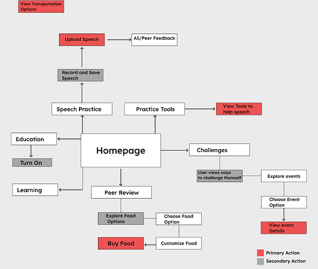
To begin the design process, I constructed a information architecture to highlight the users journey. This showcases the users end goal being completed and the process they take to complete it.
Information Architecture
Wireframes

Iteration
After creating my low fidelity wireframes, I decided to test them out with people who within my toastmasters club. I was able to draw some insights on what I should do to edit the wireframes.
Better User Flow.

I found that users that were navigating through the prototype often had issues going back to the Homepage. I made sure to add more ways to go back.
Show more info.

Users expressed they had difficulty understanding the full purpose of the page they were on, and that more detail would help with this issue.
Challenge 1
Researching Competitors.
When I starting my research on competitors, I had some difficulty finding competitors In the same field of a Public Speaking app. I did find some indirect competitors and only 1 direct competitor that has an app. When I tested the direct competitor, I realized there was many things that could be improved upon, because the user flow was very choppy and it was not an enjoyable experience. There, I realized there was potential to create an effective prototype.
Challenge 3
Ensuring pictures and icons stand out.
While creating prototypes, I added too much text and I decided that this was not going to be an effective way of conveying information. I then added more pictures and icons to make sure that an element of the design was more emphasized. When I added the pictures and Icons, it made the designs look more clean. This made me understand the importance of pictures and icons.

Edit Colors.
Users pointed out that some of the colors were too vibrant, and shifted focus on lesser important elements. I made sure I edited some of the colors were less vibrant.

Add Challenges.
I had a lot of constructive criticism regarding the fact that there was no element of challenges within the prototypes.
Challenge 2
Determining optimal navigation bars for users.
I did plenty of ideation regarding how users will navigate from one page to another. After creating my wireframes, I had many ideas to go through, and eventually I landed on a navigation bar located at the bottom. This is something that is always accessible to the user no matter what page they are on. I made sure to have all the elements of the prototype to be divided well and included icons next to the elements so that it would be easier for users to understand where they are going.
Challenge 4
What to Highlight on Homepage.
While gathering insights doing my user-testing, it was clear that there was too many elements on the homepage. I had to declutter the homepage to ensure that there was not an overload of information. While doing my user interviews, we agreed it would be a good idea to highlight the daily challenges on the homepage so that users could easily get started on tasks.
Style Guide
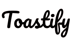
Toastify uses vibrant colors to give an inviting feel to the app. The font for the logo, "Pacifico" is a fun, hand-written, looking font. I believe this font aligns well with the values of the app.

 |  |  | ![Screenshot_2025-06-06_114235-landscape[1]_edited](https://static.wixstatic.com/media/ccfa34_b7dbe83284904d249950bae328af7906~mv2.png/v1/fill/w_250,h_473,al_c,q_95,enc_auto/ccfa34_b7dbe83284904d249950bae328af7906~mv2.png) |
|---|
Takeaways
Working on the Toastify app was a pivotal moment in my UX design journey. More than just a portfolio project, it was an opportunity to create something that could make a real difference—an app designed to help people overcome public speaking anxiety and communicate with confidence.
Through the research phase, I gained a deeper understanding of what it means to build a truly user-centered product. Analyzing competitors and identifying unique value propositions taught me how to design with empathy and purpose, aiming to fill a gap that could genuinely benefit users.
Designing wireframes and crafting the app’s interface came with its challenges, but seeing the concept grow from rough paper sketches to a polished prototype was incredibly rewarding. User testing played a crucial role—hearing directly from people who could benefit from the app helped shape the design in meaningful ways. Their feedback wasn’t just insightful; it reminded me of the human impact behind every interaction we create.
Overall, Toastify helped me grow as a designer and reinforced my belief in the power of thoughtful UX. It’s exciting to know that design can empower people—and I’m eager to carry that purpose forward into future projects.